

Visualization
We translate technical findings so that the general public can understand the results. We are experts at taking technical information and explaining it to the general public, board members, and elected officials. We create visuals and dashboards that allow the general public to understand our client’s impacts.
We excel at communicating technical data and concepts to a broad, non-technical audience. From building websites to developing attractive and informative infographics and marketing materials, we ensure that this complicated topic is presented in a way that is accessible and understandable to your audience. We thrive on the opportunity to share your story, help you celebrate your successes, and help communicate about your sustainability work in a way that engages and uplifts. See some examples of data visualizations that Lotus created for clients below!

Our team knows the importance of communicating complex data to all audiences. We take this data and create easy to understand, impactful infographics to help engage every community member in the conversation around community climate action.
Examples:
Charts, graphs, and maps
At Lotus, we love data. And we love turning that data into charts and other visual representations to accompany your inventory, analyses, and reports. We can even take your data and turn it into a map! Click around the slideshow below to check out some examples of the visuals we’ve created for our clients.
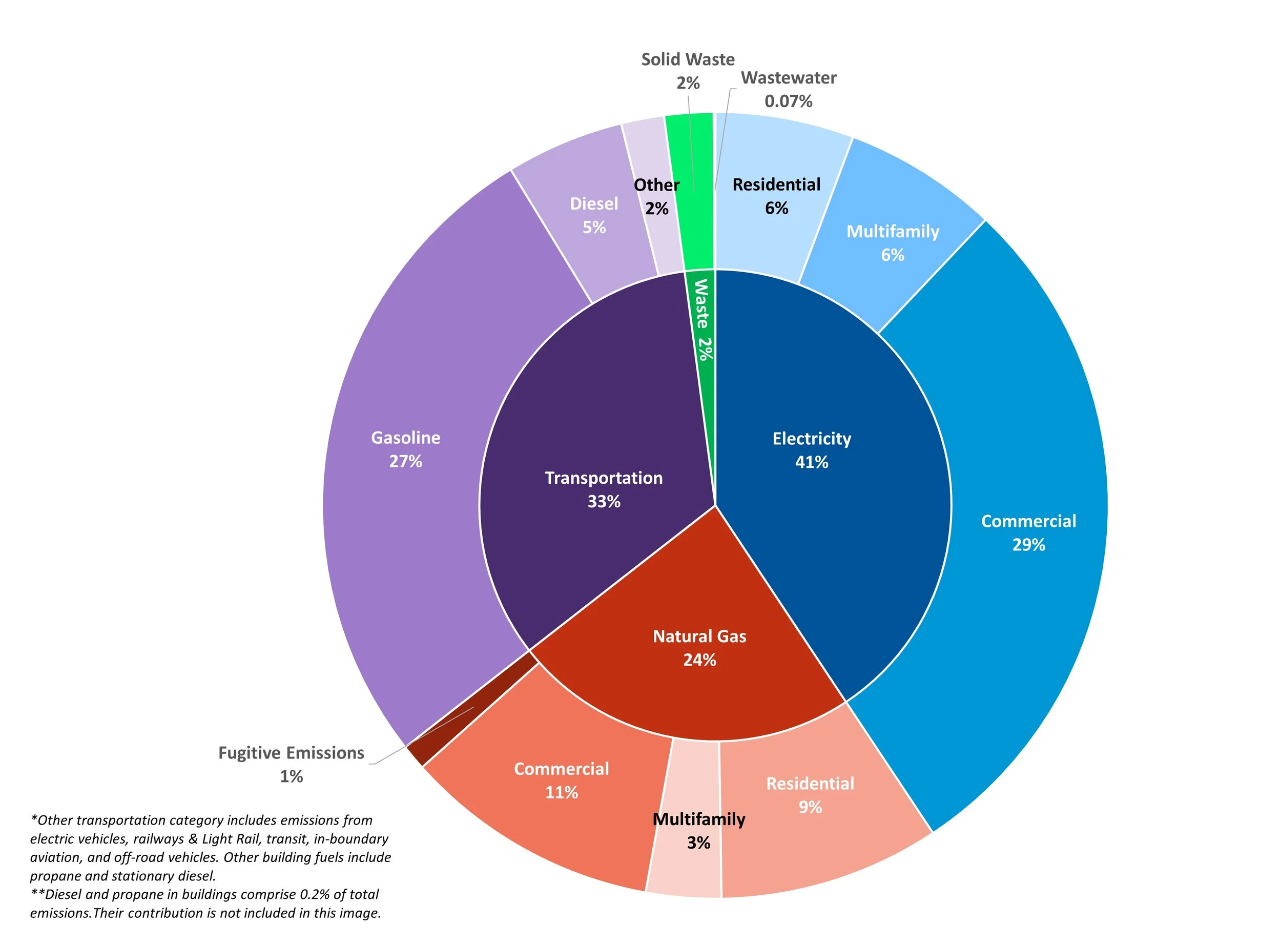
Pie/Donut Emissions Chart

GIS Maps

Marginal Abatement Axis Chart

Retrospective Waterfall Chart

Multi-Axis Charts

Business-as-usual Chart

Prospective Waterfall Chart

Emissions Trends Chart

dashboards
Our experts have the ability to create engaging, interactive data dashboards using ESRI’s ArcGIS Online, Tableau, and Microsoft PowerBI.
Interactive Web Chart
Storymaps
Georgia Tech: Georgia Tech’s Journey
City of Mission, Kansas: Greenhouse Gas Emissions
CO Resiliency Office: Colorado Risks & Vulnerabilities
CO Resiliency Office: Colorado’s Resilience Dashboard
High Country Conservation Center: Summit County Emissions Update
websites
Colorado Resiliency Office website update
Routt County Climate Action Plan website
Denver Public Schools sustainability website
STREAMLINED PROGRAM IMPACT REPORTING AND EVALUATION TOOLS
Lotus offers program impact evaluation tools as part of our suite of data visualization services. Program impact dashboards make it simple and efficient to comply with State and Federal reporting requirements, especially when new funding becomes available. These tools can also be used internally to measure program effectiveness.
Lotus breaks program impact evaluations into four steps.
Background research and metric identification.
a) Metrics can include GHG emissions reductions, energy use and cost reductions, jobs created, impacts in disproportionately impacted communities, etc.
Data collection.
Calculation and development of summary dashboard.
Reporting and sharing results with stakeholders

Sample program impact dashboard summarizing impacts of program implementation on energy use, emissions, air pollution, and jobs.